

In this blog we will explain to you how we design amazing headers and footers using Elementor Pro.

Before we can design the header and footer, we need to get a few things in order.
- Colors
- Brown: #3B2F27
- Cream: #FFF6D6
- Font
- Montserrat
- Logo
- To find logo examples, visit Freepik. Here you can find amazing logo examples. If you know Adobe Illustrator, then it’s easy to design your own logo for your company.
- Elementor Pro
- You must install Elementor from a plugin to be able to use Elementor Pro, and you can purchase Elementor Pro from here.
- Steps: WP Dashboard-> Plugin-> Add New-> Search “Elementor”-> Install Now-> Activate.
- Theme
- In my case I am using Hello Elementor and you can install it from theme tab.
- Steps: WP Dashboard-> Appearance-> Themes-> Add New-> Search “Hello Elementor”-> Install-> Activate.
Header
Now we need to create a header template from scratch. Kindly follow these steps below to create an amazing header.
Template:
- Steps: WP Dashboard-> Templates-> Click Add New from the top right-> Choose Header from Dropdown-> Type header name-> and then create template.
Section:
Click the + Icon to add a new section and select four section structures, then edit the section.
Layout Steps
- Select a layout from the Elementor editor-> set the Content Width to 1600-> Set the Vertical Alignment to Middle from the dropdown menu.
Style Steps
- Background: Select Classic as the Background Type -> Choose background color: #3B2F27.
Columns:
Now we need to give some width to all the columns that we add in a section.Hover the mouse pointer over a column to select the edit column from the main section.orYou can use the navigator to select a column easily from the bottom of the Elementor editor.
- Logo Column. Steps: From Layout, enter 7% as the column width.
- Menu Column. Steps: Enter 60% for the column width.
- Social Icon Column. Steps: Enter 13% for the column width
- Button Column. Steps: Enter 20% for the column width.
Logo Widget:
Now we need to add an image from Elementor Elements into the first column.
- Steps: search for an image in the elements section-> then drag and drop an image widget into the first column.
Now, as mentioned above, select an image widget from the navigator or edit it by selecting an image widget from the column where you added the image.
There are three tabs in all the Elementor widgets: content, style, and advanced.
Content Steps
- Choose an image from your media or upload it from your computer-> Set the image size to Full or Custom to customize the width and height to your preference.
- Now leave style and advance as a default.
Nav Menu Widget:
Add the Nav menu from the elements section into the second column and edit it.
Content Steps
- Choose your Menu from the dropdown -> Set Align to the left -> Breakpoint will be tablet-> Enable Full Width-> Select center from the Align dropdown.
Style Steps
- Main Menu: Typography-> Family: Montserrat-> Size: 20PX-> Weight: 600-> Normal-> Text Color: #FFF6D6-> Hover-> Text Color: #FFF6D6-> Pointer Color: #FFF6D6-> Active is also the same as Hover Color.
- Dropdown: Typography-> Family: Montserrat-> Size: 20PX-> Weight: 600-> Hover-> Text Color: #FFF6D6-> Background Color: #3B2F27-> Active is also the same as Hover Color. Horizontal Padding:20-> Vertical Padding: 20.
- Toggle Button: Normal-> Color: #3B2F27-> Background Color: #FFF6D6-> Hover-> Color: #3B2F27-> Background Color-> #FFFFFF.
- Responsive Mode: Select responsive mode from the bottom of the Elementor Editor and select Mobile View-> Now we need to give column size to 50% each in the same order as it is right now. Then there will be two columns in a row. The first row will include the Logo and Menu, and the second row will include the Social Icon and Button.
Social Icons Widget:
Drag and Drop the Social Icons from the elements section into the third column and edit it.
Content Steps
- By default, we have three tabs. If you want to add some tabs, click Add Items-> Add Icon from Elementor library-> Add URL of your social link-> Alignment: right.
Style Steps
- Icon: Color: Custom-> Primary Color: #FFFFFF00-> Secondary Color: #FFF6D6-> Size: 27-> Padding: 0.2-> Spacing: 5
- Icon Hover: Primary Color: #02010100-> Secondary Color: #FFFFFF-> Hover Animation: Shrink.
- Tablet View: Set the column width and adjust the columns in one row.
Button Widget:
Drag and Drop the Button from the elements section into the fourth column and edit it.
Content Steps
- Button: Text-> Any text you type will appear on the top of the button-> Link: Add URL-> Alignment-> Right
Style Steps
- Button: Typography-> Family: Montserrat-> Size: 21PX-> Weight: 700-> Normal-> Text Color: #3B2F27-> Background Type: Classic-> Color: #FFF6D6-> Hover-> Text Color: #3B2F27-> Background Type: Classic-> Color: #FFFFFF-> Hover Animation: Shrink-> Border Radius: 0.
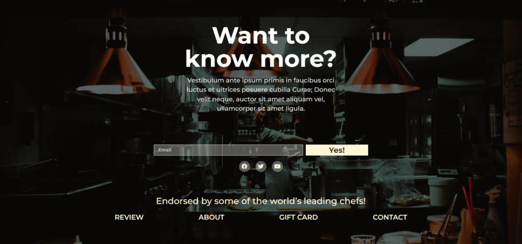
Footer
Now we need to create a footer template from scratch.
Template:
- Steps: WP Dashboard-> Templates-> Click Add New from the top right-> Choose Footer from Dropdown-> Type footer name-> and then create template.
Section:
Click the + Icon to add a new section and select single section structures, then edit the section.
Layout Steps
- Select a layout from the Elementor editor-> set the Content Width to 1600->Height: Select Min Height from Dropdown-> Type: 900PX-> Set the Vertical Alignment to Middle from the dropdown menu.
Style Steps
- Background: Select Classic as the Background Type-> Choose Image from Media or Upload it from computer-> Position: Center Center-> Repeat: No-repeat-> Size: Cover.
- Background Overlay: Select Classic as the Background Type-> Color: #000000-> Opacity: 0.6.
Inner Section Widget:
In the footer, we need to add one more section called “Inner Section” from Elements and then edit the section.
Layout Steps
- Select a layout from the Elementor editor-> set the Content Width to 595PX
Heading Widget:
Drag and drop the Heading widget from the Elements library into the Inner Section widget.
Content Steps
- Title: Type your title here.
Style Steps
- Title: Text Color: #FFFFFF-> Typography-> Family: Montserrat-> Size: 85PX-> Weight: 700.
Text Editor Widget:
Drag and drop the Text Editor widget from the Elements library into the Inner Section widget.
Content Steps
- Text Editor: Type your text or paragraph here.
Style Steps
- Text Editor: Alignment: Center-> Text Color: #E1E1E1-> Typography-> Family: Montserrat-> Size: 23PX-> Weight: 500.
Inner Section Widget:
We need to add one more Inner Section Widget for the subscription form.
Layout Steps
- Select a layout from the Elementor editor-> set the Content Width to 800PX
Form Widget:
Drag and drop the Form widget from the Elements library into the second Inner Section widget.
Content Steps
- Form Field: By default, we do have three form fields, and we only need to email and delete the remaining fields.
- Email Field: Click on email field and Select-> Content-> Type: Email-> Placeholder: Email-> column width: 70% and leave the rest as a default.
- Label: Disable.
- Button: Select Button-> Column Width: 30 %-> Alignment: Justified.
- Action After Section: Select Action After Submit-> Add Action: Add MailChimp and a new row will appear for Mail Chimp or you can choose your own email marketing CRM or Software.
- Mail Chimp: In this section you need to add your MailChimp API key.
Style Steps
- Form: Label-> Typography-> Family: Montserrat and keep it as a default and also in HTML Field typography.
- Field: Text Color: #FFFFFF-> Typography-> Family: Montserrat-> Size: 16PX-> Weight: 700-> Background Color: #FFFFFF4D-> Border Color: #FFF6D6-> Border Width: 1-> Border Radius-> 0.
- Buttons: Typography-> Family: Montserrat-> Size: 28PX-> Weight: 700-> Select Normal-> Background Color: #FFF6D6-> Text Color: #3B2F27-> Select Hover-> Background Color-> #FFFFFF-> Text Color: #3B2F27-> Animation: Shrink.
- Messages: Typography-> Family: Montserrat.
Social Icons Widget:
Drag and drop the Social Icons from the Elements library into the second Inner Section widget the below form.
Here we use a shortcut to add the same style as we designed it on the header. Now open the header template by clicking Edit with Elementor and then copy the Social Icons Widget from the header and paste it below the form into your footer template.
Content Steps
- Alignment: center.
Style Steps
- Icon: Color: Custom-> Primary Color: #FFFFFF52-> Secondary Color: #FFF6D6-> Size: 20-> Spacing: 20-> Border Type: 30.
- Icon Hover: Secondary Color: #FFFFFF-> Hover Animation: Shrink.
Heading Widget:
Drag and drop the Heading widget again from the Elements library into the Main Section not into the Inner Section.
Content Steps
- Title: Type your title here.
Style Steps
- Title: Text Color: #FFF6D6-> Typography-> Family: Montserrat
Nav Menu Widget:
Drag and Drop the Nav menu from the Elements library into the Main Section not into the Inner Section below Heading widget.
Again we use a shortcut to add the same style as we designed it on the header. Now open the header template by clicking Edit with Elementor and then copy the Nave Menu Widget from the header and paste it below the last Heading widget into your footer template.
Content Steps
- Choose your Menu from the dropdown -> Set Align to the Center -> Breakpoint will be None.
Style Steps
- Main Menu: Typography-> Family: Montserrat-> Size: 20PX-> Weight: 600-> Horizontal Padding: 100.
Table View and Mobile View
Leave it as a default for footer